
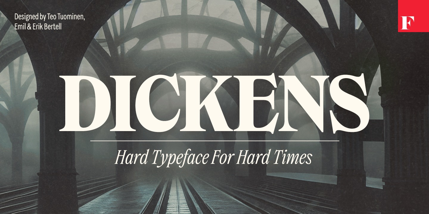
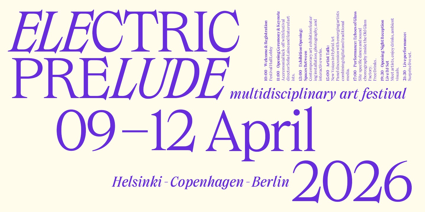
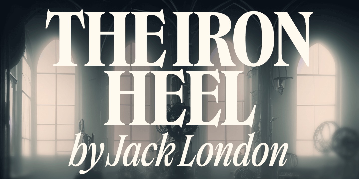
Dickens Font – As the 21st century’s faith in the future is shattered, the zeitgeist is no longer captured by resorting to universal, neutral-looking, sans serif fonts – but rather by serifed ones that express tradition and severity, with quirks and personality. Dickens breathes a hard-working vitality. It may not be universal in appearance – but it is surprisingly local. The font family is equally suitable for use by a trendy natural cosmetics brand or as a brand font for a start-up that utilizes artificial intelligence, as it is for the visuals of a newly opened Bushwick micro brewery – bringing a lot of personality and a recognizable, distinct voice. Dickens is equipped with two different widths: the narrower one can survive even in tight times when public funding is being cut. The weights of the fonts range from thin to very thick, so you are sure to find the right tone. All fonts also have italic versions. On the other hand, there are no unnecessary features – this is a hard font for hard times, after all.
Only logged in customers who have purchased this product may leave a review.
Reviews
There are no reviews yet.